Our legacy live classroom, straight out of 2005. Beyond the dated UI, it was laggy, bloated, and difficult to build on top of.
The new classroom adapts to the session, not the other way around. Talk puts faces front and center. Work modes like whiteboard and practice put content first. Everything else stays within reach but out of the way.
Most AV issues on the old platform started because people joined with broken setups. The green room catches that before the session starts, and a subtle commitment nudge keeps tutors camera-on.

Sessions open face-to-face. Human connection first, content second.

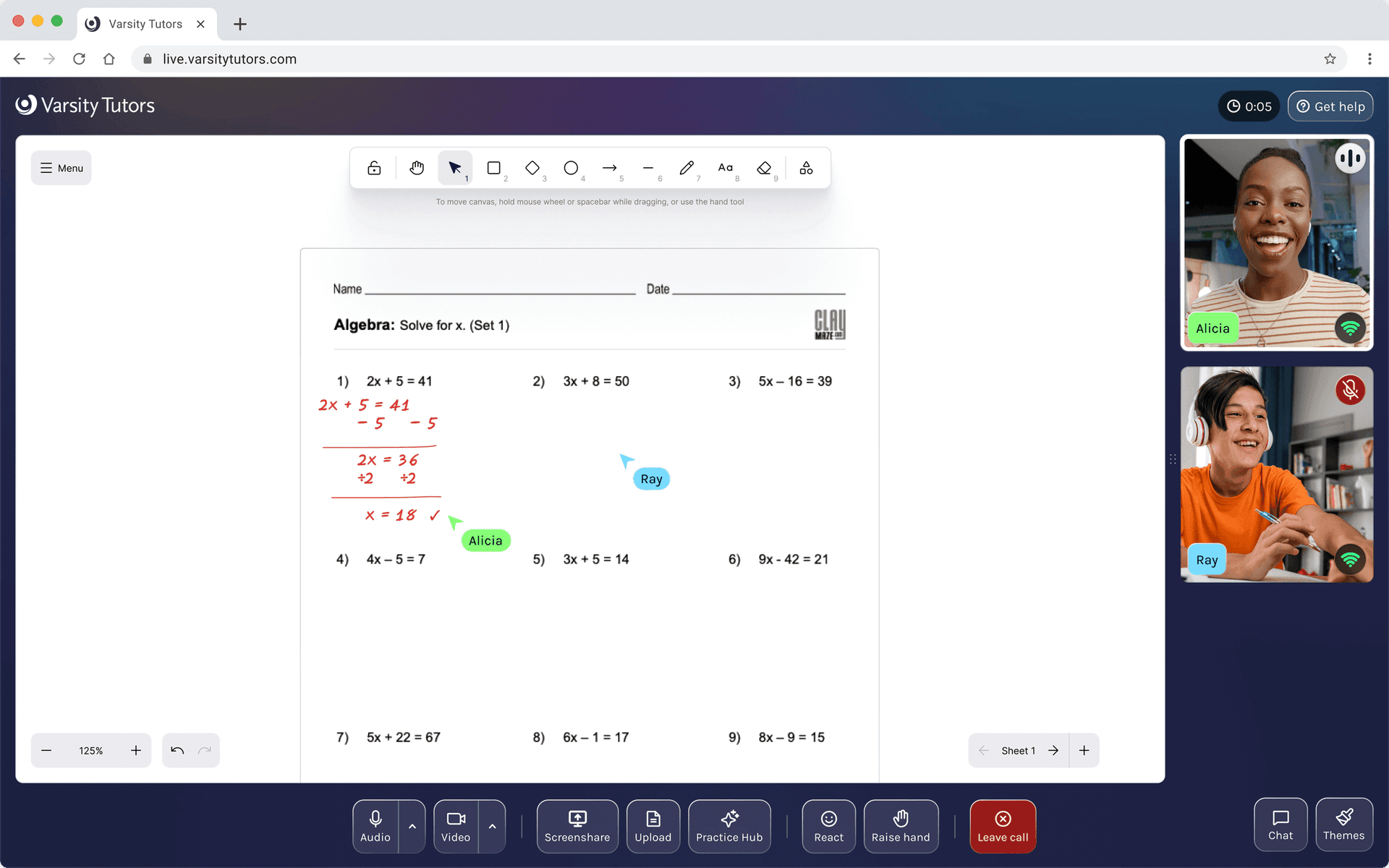
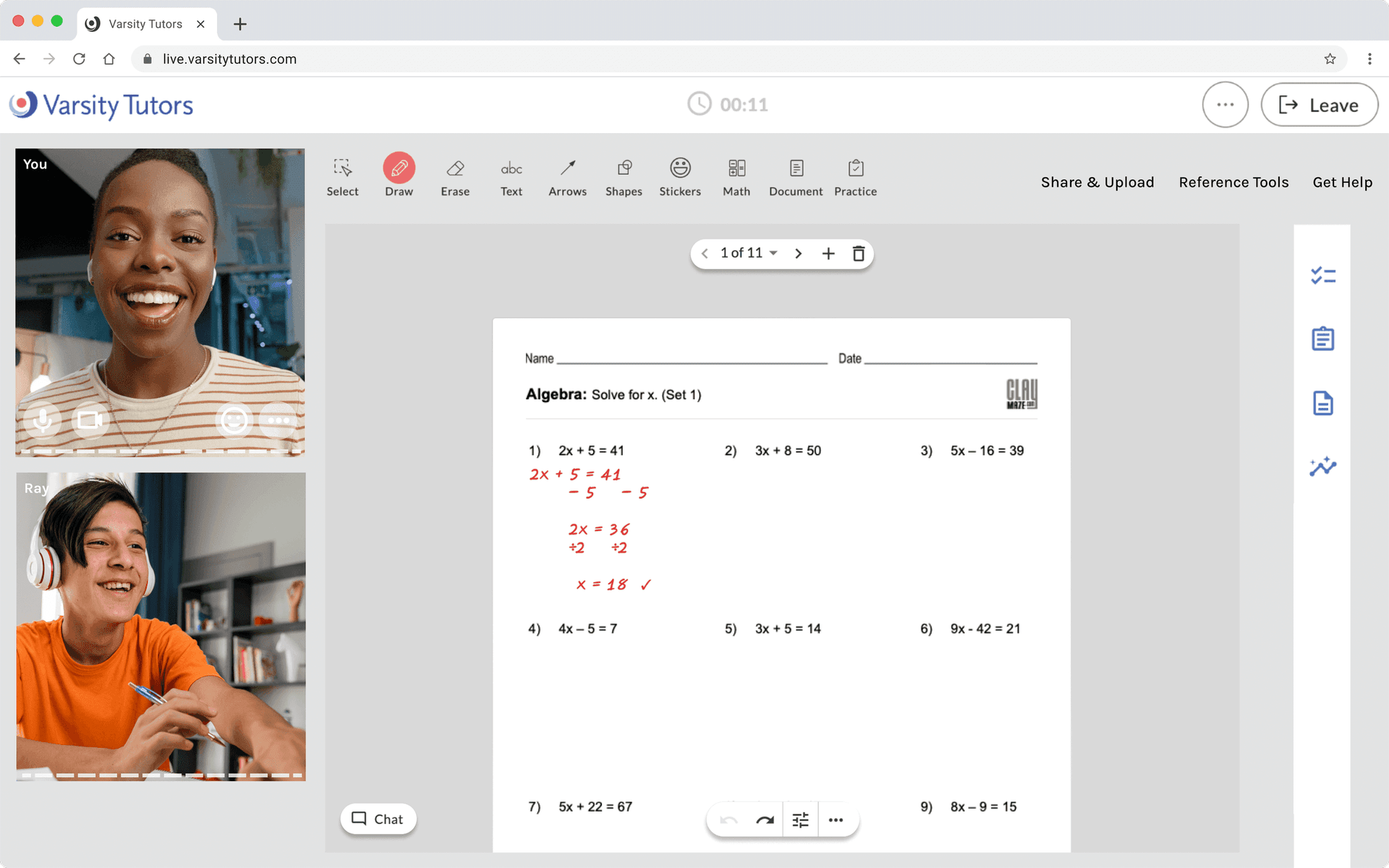
When the session shifts to the whiteboard, the UI follows. Video recedes to thumbnails and the content fills the screen.

Surfaces like chat slide in without displacing the work area. Here, a tutor shares a worksheet ahead of the lesson, ready for when the student arrives.

A fire emoji during a chemistry lesson. Reactions give students a way to participate that feels natural, no hand-raising required (but there's that too).

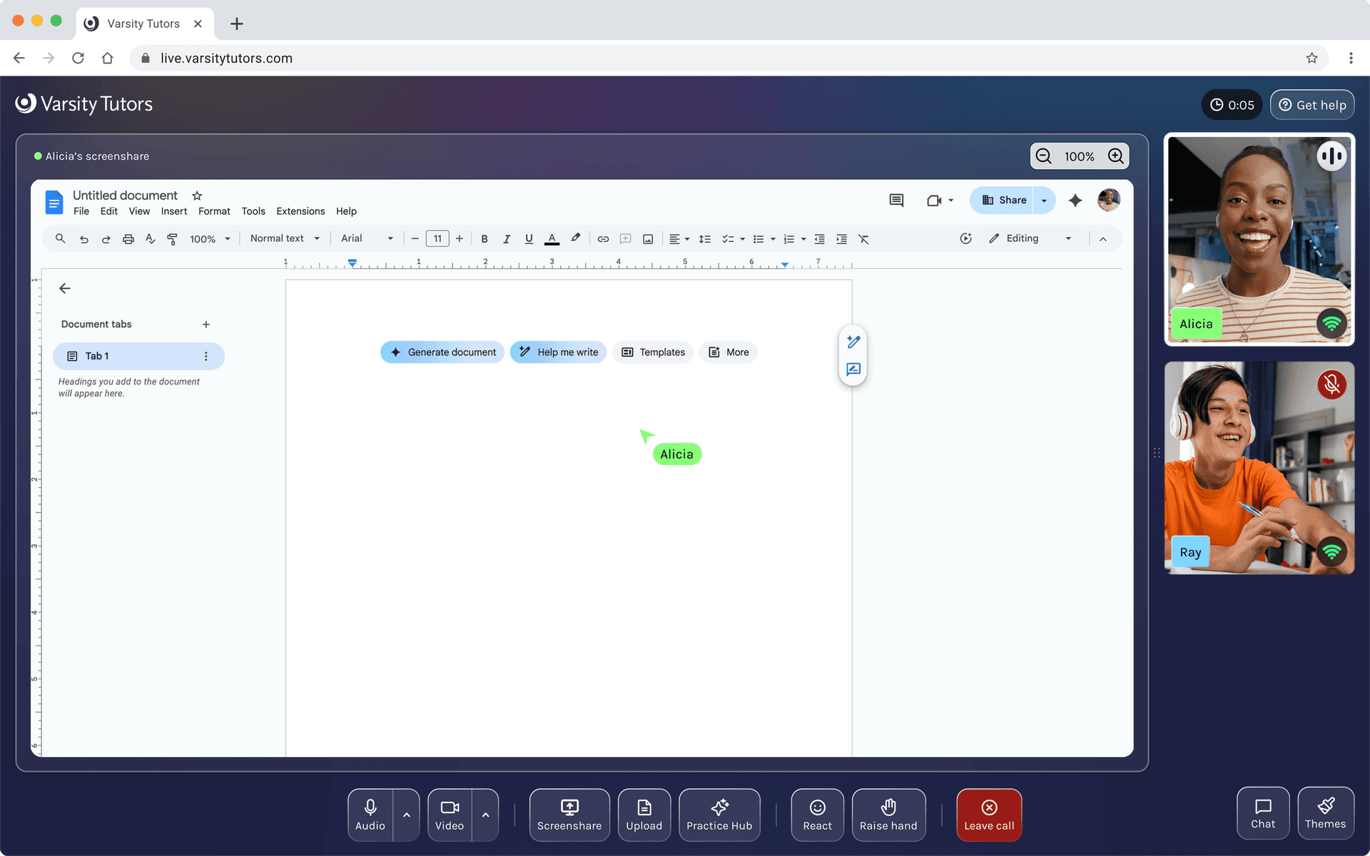
The classroom isn't a walled garden. Screen sharing lets tutors and students work together in any tool, here a Google Doc.
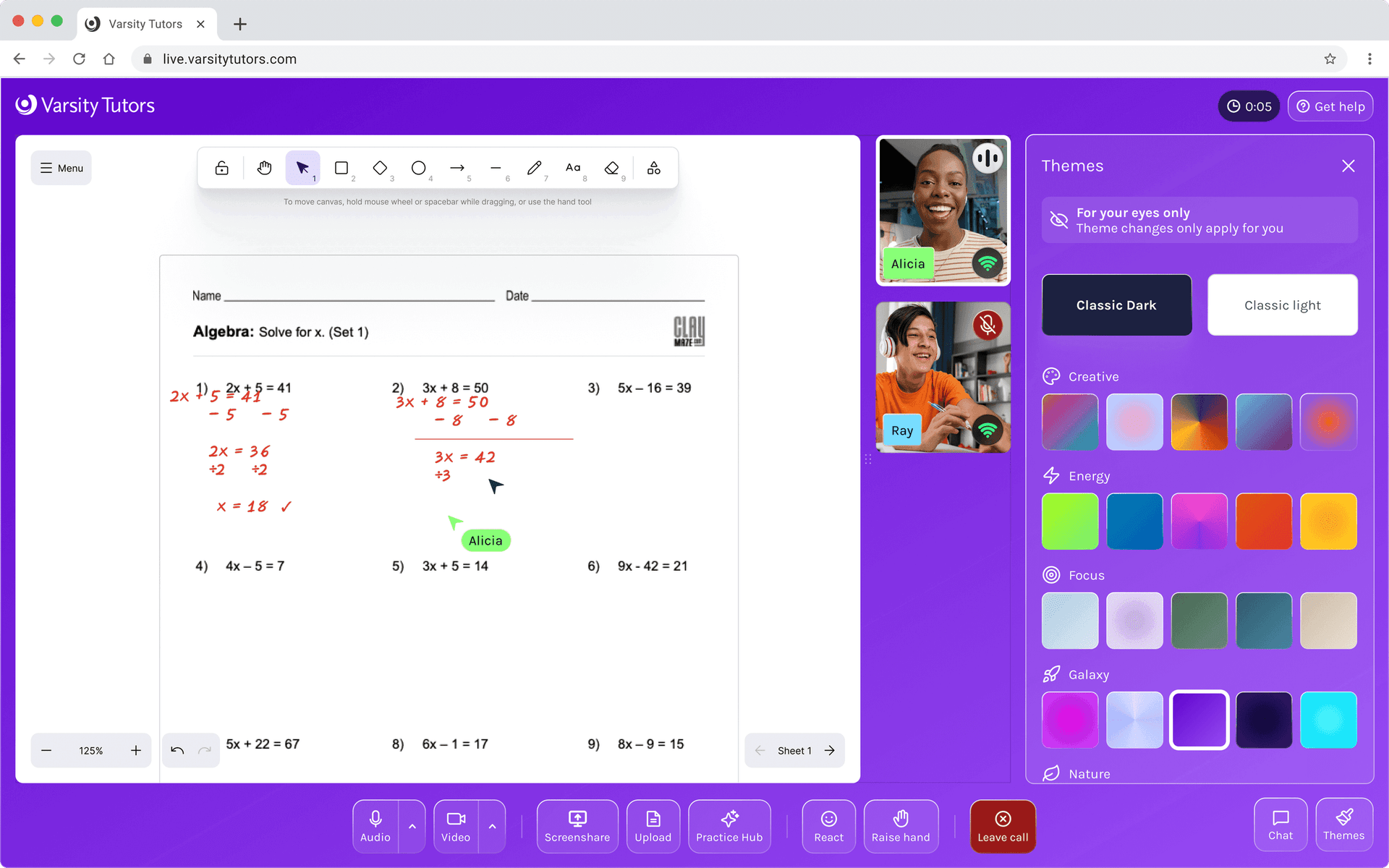
Students pick a theme that fits their mood. The UI adjusts automatically so text stays readable with every choice.
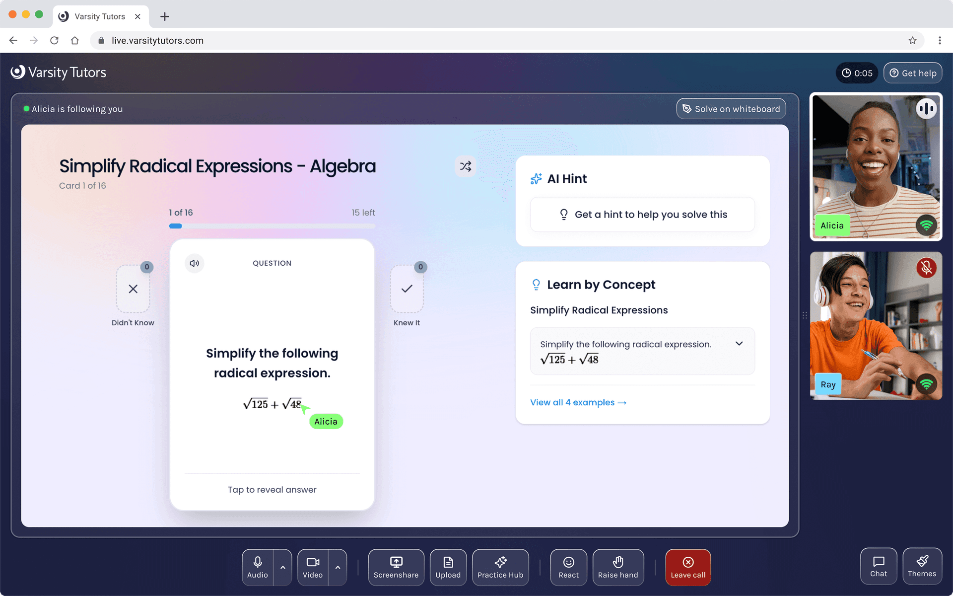
Tutors can pull from a curated content library mid-session. Flashcards, worked examples, AI hints, all without leaving the room.